When I decided to paint a scene from
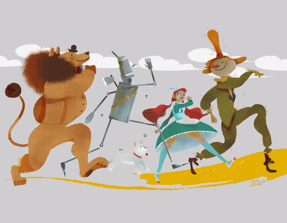
The Wizard of Oz, the first problem I had was deciding what the characters should look like. It's really hard to exorcise the 1939 MGM film from your mind and to do something original; the costumes have become such iconic representations. Almost any artwork you look at pays homage to the film, like this lovely piece by Scott Gustafson.
Even modern takes on the characters, like this one by Skottie Young, feature costumes that are still very MGM-inspired:
As is this Manga-inspired artwork for the video game Beyond the Yellow Brick Road:
And this lovely piece by Maurenilson Freire (Marchine):
And this piece of joy by Chiachi Wang (Popnbox):
Occasionally I do find an original take on the subject such as this gorgeous piece by
Júlia Sardà (below) but they are few and far between.
.
Therefore, the obvious thing seemed to be to go back to the source material and see how L Frank Baum described the characters. Maybe that would offer me some flexibility.
There is no description given of Dorothy whatsoever other than she is 'a little girl' and 'a well-grown child for her age' around the same height as a Munchkin. She does, however, get dressed before setting off down the yellow brick road: 'It was gingham, with checks of white and blue; and although the blue was somewhat faded with many washings,it was still a pretty frock. The girl washed herself carefully, dressed herself in the clean gingham, and tied her pink sunbonnet on her head.' So, to be totally faithful to the book, a blue gingham frock and pink sun bonnet would be needed, plus a basket of bread that she takes with her, covered by a white cloth. Her shoes, which she recovers from the dead witch, are silver and not ruby. Toto, incidentally, is described as 'a little black dog, with long silky hair and small black eyes that twinkled merrily on either side of his funny, wee nose.' I decided to make my Dorothy quite young to get away from the Judy Garland 'I'm clearly in my 20s but dressed as a schoolgirl' image. My 10 year old granddaughter Leah became the model.
I had a very clear idea in my head for the Scarecrow. When I was growing up in Cornwall, farmers and allotment owners would often use pumpkins - sometimes fresh, sometimes leftover from Halloween - as the heads for scarecrows. However, in the books, the Scarecrow is described thus: 'Its head was a small sack stuffed with straw, with eyes,nose, and mouth painted on it to represent a face. An old, pointed blue hat, that had belonged to some Munchkin, was perched on his head,and the rest of the figure was a blue suit of clothes, worn and faded,which had also been stuffed with straw.' That effectively scuppered my plans ... unless I swapped him out for another Oz character called Jack Pumpkinhead who first appears in The Marvelous Land of Oz. I knew he'd be a more striking looking character than a chap with a sack for a head. It then occurred to me that my painting didn't have to be set within the confines of the first Oz book. There are 14 canonical books in the series written by Baum himself (and a handful of plays and short stories) plus a further 50+ books by other authors. It seems quite possible, therefore, that Dorothy and Toto could have walked along the Yellow Brick Road at some point with the Tin Woodman, Jack Pumpkinhead and the Cowardly Lion. Plus, of course, I could now change the characters' clothes if I wanted. Suddenly, I could exercise a lot more creative licence.
And, yes, the inane look on Jack's face probably does owe something to Groot in Guardians of the Galaxy as it was a film I watched during the sketching stages. That said, I tried it out on a real pumpkin first!
The Tin Woodman was nicely short on description: 'One of the big trees had been partly chopped through, and standing beside it, with an uplifted axe in his hands, was a man made entirely of tin. His head and arms and legs were jointed upon his body, but he stood perfectly motionless, as if he could not stir at all.' So my Tin Woodman went through a number of development stages before I arrived at a shape I liked (and which pleasingly echoed the body shape of Tik-Tok, a character from the Oz book Ozma of Oz and the feature film Return to Oz.)
I didn't bother to sketch the lion as I thought, 'Ah, it's just a lion - I'll wing it on the day'. In retrospect it was a very stupid decision as you'll see.
Anyhow, here's the final composition sketch and the underpainting. I chose a 20" by 16" by 3/4" double-primed canvas and used a watered down burnt umber paint.
Now came the fun part, slapping on the paint. First stage, as always, is .... get rid of the white. For this painting I used a combination of Daler Rowney System 3 acrylics and Liquitex Professional heavy body acrylics.
I've always been a bit ropey on perspective so I spent an indecent amount of time mucking about with the 'bricks' which, to be honest, are probably better referred to as 'yellow slabs'.
It was around this time that I made several important decisions: (1) to include some nasty anthropomorphic trees as they were some of my favourite characters in the 1939 film, (2) to give the Tin Woodman a coal scuttle for a helmet as everyone does the funnel, and (3) to sort the lion out as he looked more like a bear with a mane.
It was then that I realised my mistake in not sketching lions beforehand; I had no idea how to draw one. Very quickly things went from bad to worse. No wonder the poor sod looks so worried. He went from this (above) to this (below) ...
And then, finally, (after some much needed research and sketching of lions) to this:
By this time I'd done some work on Dorothy, moved one of the Tin Woodman's legs to give him a jerkier gait, turned his axe around and given him a good patina of rust, and added in some more trees. You may recognise the tree face on the left. It's an homage to the 1974 sci fi film Zardoz, which references The Wizard of Oz (the clue is in the name). In the film, a huge stone head flies about the place subjugating the population, much like the giant scary head of Oz does in Baum's original tale. It seemed like a fun thing to include - a little visual joke that maybe only a few film nerds would get. Plus, the face is very reminiscent of many pagan 'Green Man' carvings and masks you find around the UK.

Finally, I repainted Toto (as I'd got his body shape all wrong on the first attempt - I'm as crap at dogs as I am at lions) and finished Dorothy off. And, by that, I mean changed her dress. I'd started off using pink as it seemed suitable for a girl of that age but the colour jarred with the overall composition. I realised that blue would compliment her eyes and the Wedgewood blue of the sky. So I made the dress blue or, rather, the night-dress. The whole Oz saga has a kind of dream-like quality and the film ends with Dorothy waking up so shouldn't she be in a nightie? By coincidence I then discovered that the lady who had bought the painting loves the colour blue. So all was well.
Here's the finished painting.
I hope you like it.
Note: All artwork copyright (c) 2015 Stevyn Colgan and the respective artists named above.


.jpg)

.jpg)




.jpg)

