Saturday 28 February 2015

Columbus - Step by Step

Here's another new painting I've done.

It was inspired by a book called Flotsametrics and the Floating World by scientists Curtis Ebbesmeyer and Eric Scigliano.


Ebbesmeyer became obsessed with floating garbage - from rubber ducks to discarded Nike trainers - and where it travels to and from. In particular, he was fascinated with discovering the fate of some 29,000 'friendly floatees' children's bath toys - red beavers, green frogs, blue turtles and yellow ducks - that were swept overboard in a container in 1992.  (I blogged about it in some depth back in 2012 - you can read it here). Ten months after the incident the first Floatees began to wash up along the Alaskan coast. The first discovery consisted of ten toys found by a beachcomber near Sitka, Alaska on 16 November 1992, about 2,000 miles (3,200 km) from their starting point. Ebbesmeyer and colleague James Ingraham contacted beachcombers, coastal workers, and local residents to locate hundreds of the beached Floatees over a 530 mile (850 km) shoreline. Long story short, by logging the travels of the Floatees plus lots of other lost items, Ebbesmeyer was able to revolutionise ocean science by showing that ocean currents don't work like we assumed they did.

Anyway, I thought it would be great to do a painting that captures the loneliness of the long-distance rubber duckie. And, to give a sense of space, I figured I'd need a big canvas to convey the smallness of the duck.

So, I picked a 24" by 30" by 3/4" box canvas and 'got rid of the white'.


I hated it almost immediately and the duck was waaaaaaay too big. So, the following day, and inspired by a particularly gorgeous sunset, I had another go.


Things seemed to be going okay so I added some waves and some more cloud textures.


But then I had a realisation: The waves probably wouldn't break like that out in the deep ocean. And the scale was all wrong if I wanted to have a tiny duck. Plus, I reckoned that a night time scene would look even more lonely. My final realisation was that, with yellow being the complimentary colour of blue, I'd get the greatest contrast if the painting was predominantly blue. So, another attempt ...


I realise that it's probably not as striking an image as I could have painted. But I'm happiest with this version. The photo, sadly, doesn't do it justice as the colours are very different in the original with lots of different and subtle shades of blue. Oh, and here's Duckie in close-up:


It made an interesting change to do a painting so devoid of detail and colour and I enjoyed the process. I've no idea whether anyone but me will like it but, then again, I paint for my own pleasure and satisfaction.

If other people like it, that's a bonus.

If, occasionally, people buy them, that's an amazing double bonus!

More paintings soon!

Wow! It's WAWOW!

Here's my appearance on the first edition of the new online TV  magazine show WAWOW hosted by Ruth Curtis at iconic Pinewood Studios.


WAWOW's website is wawow.co.uk and their YouTube channel is here.

The channel was launched this week - I wish them every success!

Thursday 26 February 2015

Justyna Kopania - Her paint bills must be enormous

I wish I could paint like Polish artist Justyna Kopania. The paint is applied so thickly and so freely and yet the finished result is a beautifully considered piece every time.


I wish I could be that expressive and loose in my work. I'm altogether too rigid. Maybe I should get the palette knives out and have a play?


You can see more over on Saatchi Art and Facebook.

Marginalia Madness

Last year I was at the Edinburgh Festival and made a point of going to watch Holly Walsh's show Never had IT. I'd met Holly earlier in the year after Graham Linehan had put us in contact. Holly was working on a script for a new TV comedy pilot and needed some policing procedures advice. She's a charming and very funny lady. Anyhow, as I was in Edinburgh to do a show with John Lloyd and some QI/Museum of Curiosity colleagues, I popped along to see her. The show, as I'd expected, was very funny and was a kind of autobiography, highlighting her natural geekiness and nerdity. But one section of the show stood out - the section on her fascination with marginalia. It sparked an interest in me too and I've been seeking it out ever since.

Marginalia is a posh name for 'Mediaeval doodling'. In the days before printing presses, books had to be meticulously copied by scribes; often people who had taken holy orders. The monks and nuns would also be called upon to illuminate the books and manuscripts with coloured illustrations and fancy capital letters. And, just occasionally, presumably out of boredom or mischief, they would doodle in the margins - hence marginalia. Sometimes they wrote poems and prayers. Other times they drew pictures, and a few were hilariously rude and imaginative. Like this knight fighting a snail ...


And this guy squaring up to a savage rabbit.

 
But now let's sink deeper into the marginalia mire. Oh look! Here's some monkey sodomy ...
 
 
And a penis tree (and happy nun) ...
 

 And a chap giving himself a prostate self-examination outside the chess club meeting.


Here's a mermen having his pile ointment delivered by arrow ...


And a rabbit with a big chopper.


And here's proof that Jedi master Yoda really is old.

 
See why I love this stuff??

LOADS more to be found here at Got Medieval?

Wednesday 25 February 2015

Pin-Up Painting Posers

With all of the recent furore over Page 3 of The Sun, I thought it would be nice to return to a simpler, less-contentious time when pin-ups were chaste and fun. I love these fascinating 'behind-the-scenes' pics of models and the paintings they eventually became.


These are all works by the celebrated pin-up artist Gil Evgren who is probably the best-known such artist after Alberto Vargas. He was active from the 1930s right through to the 1970s but his most famous work dates from the 40s and 50s. If you want to know more about him, his website is here.


It's interesting to see how the finished art differs from the original photos isn't it? Image manipulation was happening a long time before Photoshop arrived ...


Thursday 19 February 2015

Pat Perry's travelling sketchbook

Michigan-based artist Pat Perry spent most of 2014 living a transient life across the US. His travels took him backpacking, train hopping, and motorcycling with stops in New England, Arkansa, and Texas, all the while dutifully recording his thoughts and observations in his sketchbook.

The presence of rural America is a near constant presence in Perry’s work, as well as the frustrations and occasional warnings of humanity colliding with the natural world.


Perry has a number of prints available in his shop and you can also follow his ongoing adventures on Instagram.

Info for this blogpost lifted directly from Colossal.

Tuesday 17 February 2015

Shiver Me (Reclaimed) Timbers

This is one of my favourite places in Cornwall. It's called Shiver Me Timbers! and it's in a place called Long Rock, halfway between Penzance and Marazion, and whenever I visit home I cannot resist going in for a mooch around. There should be more places like this.


All photos copyright (c) 2014 Stevyn Colgan

Sunday 15 February 2015

Some day my prints could come ... to your house

 
I have some prints for sale. They come in two sizes, A4 and A3 and are printed on mid-weight semi gloss art paper. The price?
 
A4 = £15
A3 = £20
 
This includes postage and packing and I'll sign each one.
 
Interested?
 
Email me at: stevyncolgan@me.com
 
 
Print 1: Uranus is So Bracing
 
 
Print 2: See Uranus


Print 3: San Diego Cosplayers


Print 4: Yellow Brick Road

 
Print 5: The Not Very Hungry Human Centipede


Thursday 12 February 2015

The Yellow Brick Road - Step by Step

When I decided to paint a scene from The Wizard of Oz, the first problem I had was deciding what the characters should look like. It's really hard to exorcise the 1939 MGM film from your mind and to do something original; the costumes have become such iconic representations. Almost any artwork you look at pays homage to the film, like this lovely piece by Scott Gustafson.


Even modern takes on the characters, like this one by Skottie Young, feature costumes that are still very MGM-inspired:

 
As is this Manga-inspired artwork for the video game Beyond the Yellow Brick Road:


And this lovely piece by Maurenilson Freire (Marchine):

 
And this piece of joy by Chiachi Wang (Popnbox):
 
 
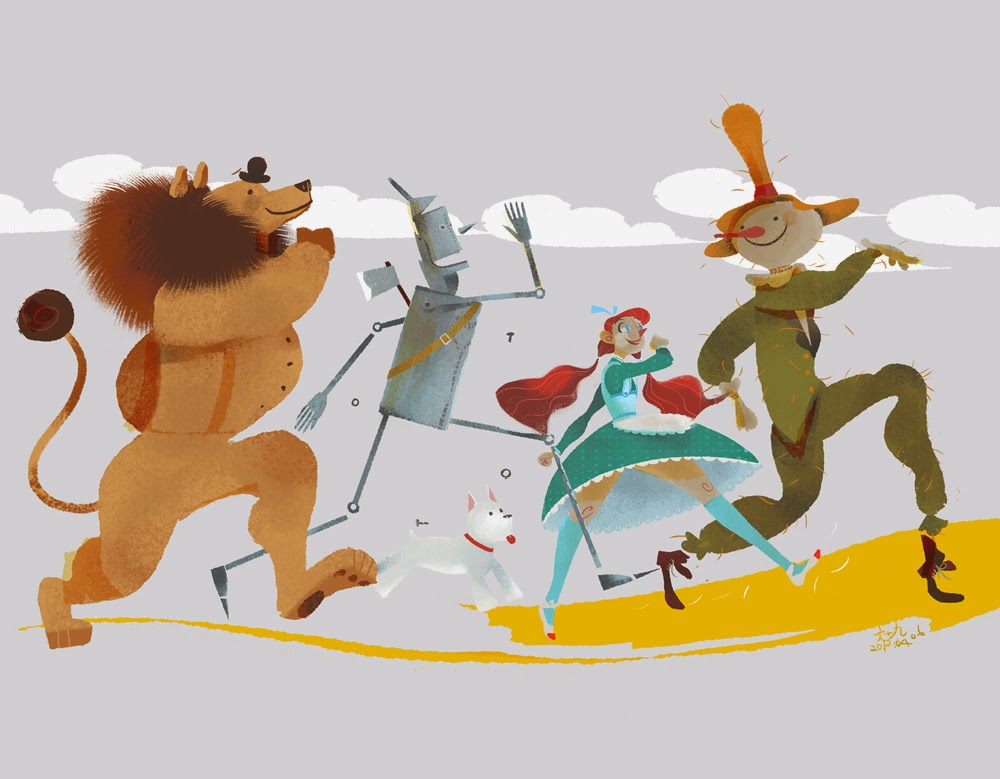
Occasionally I do find an original take on the subject such as this gorgeous piece by Júlia Sardà (below) but they are few and far between.
.
 
Therefore, the obvious thing seemed to be to go back to the source material and see how L Frank Baum described the characters. Maybe that would offer me some flexibility.
 
There is no description given of Dorothy whatsoever other than she is 'a little girl' and 'a well-grown child for her age' around the same height as a Munchkin. She does, however, get dressed before setting off down the yellow brick road: 'It was gingham, with checks of white and blue; and although the blue was somewhat faded with many washings,it was still a pretty frock. The girl washed herself carefully, dressed herself in the clean gingham, and tied her pink sunbonnet on her head.' So, to be totally faithful to the book, a blue gingham frock and pink sun bonnet would be needed, plus a basket of bread that she takes with her, covered by a white cloth. Her shoes, which she recovers from the dead witch, are silver and not ruby. Toto, incidentally, is described as 'a little black dog, with long silky hair and small black eyes that twinkled merrily on either side of his funny, wee nose.' I decided to make my Dorothy quite young to get away from the Judy Garland 'I'm clearly in my 20s but dressed as a schoolgirl' image. My 10 year old granddaughter Leah became the model.
 
I had a very clear idea in my head for the Scarecrow. When I was growing up in Cornwall, farmers and allotment owners would often use pumpkins - sometimes fresh, sometimes leftover from Halloween - as the heads for scarecrows. However, in the books, the Scarecrow is described thus: 'Its head was a small sack stuffed with straw, with eyes,nose, and mouth painted on it to represent a face. An old, pointed blue hat, that had belonged to some Munchkin, was perched on his head,and the rest of the figure was a blue suit of clothes, worn and faded,which had also been stuffed with straw.' That effectively scuppered my plans ... unless I swapped him out for another Oz character called Jack Pumpkinhead who first appears in The Marvelous Land of Oz. I knew he'd be a more striking looking character than a chap with a sack for a head. It then occurred to me that my painting didn't have to be set within the confines of the first Oz book. There are 14 canonical books in the series written by Baum himself (and a handful of plays and short stories) plus a further 50+ books by other authors. It seems quite possible, therefore, that Dorothy and Toto could have walked along the Yellow Brick Road at some point with the Tin Woodman, Jack Pumpkinhead and the Cowardly Lion. Plus, of course, I could now change the characters' clothes if I wanted. Suddenly, I could exercise a lot more creative licence.
 
And, yes, the inane look on Jack's face probably does owe something to Groot in Guardians of the Galaxy as it was a film I watched during the sketching stages. That said, I tried it out on a real pumpkin first!
 
 
The Tin Woodman was nicely short on description: 'One of the big trees had been partly chopped through, and standing beside it, with an uplifted axe in his hands, was a man made entirely of tin. His head and arms and legs were jointed upon his body, but he stood perfectly motionless, as if he could not stir at all.'  So my Tin Woodman went through a number of development stages before I arrived at a shape I liked (and which pleasingly echoed the body shape of Tik-Tok, a character from the Oz book Ozma of Oz and the feature film Return to Oz.)
 
 
I didn't bother to sketch the lion as I thought, 'Ah, it's just a lion - I'll wing it on the day'. In retrospect it was a very stupid decision as you'll see.
 
Anyhow, here's the final composition sketch and the underpainting. I chose a 20" by 16" by 3/4" double-primed canvas and used a watered down burnt umber paint.


Now came the fun part, slapping on the paint. First stage, as always, is .... get rid of the white. For this painting I used a combination of Daler Rowney System 3 acrylics and Liquitex Professional heavy body acrylics. 


I've always been a bit ropey on perspective so I spent an indecent amount of time mucking about with the 'bricks' which, to be honest, are probably better referred to as 'yellow slabs'.

 
It was around this time that I made several important decisions: (1) to include some nasty anthropomorphic trees as they were some of my favourite characters in the 1939 film, (2) to give the Tin Woodman a coal scuttle for a helmet as everyone does the funnel, and (3) to sort the lion out as he looked more like a bear with a mane.
 
 
It was then that I realised my mistake in not sketching lions beforehand; I had no idea how to draw one. Very quickly things went from bad to worse. No wonder the poor sod looks so worried. He went from this (above) to this (below) ...
 
 
And then, finally, (after some much needed research and sketching of lions) to this:
 
 
By this time I'd done some work on Dorothy, moved one of the Tin Woodman's legs to give him a jerkier gait, turned his axe around and given him a good patina of rust, and added in some more trees. You may recognise the tree face on the left. It's an homage to the 1974 sci fi film Zardoz, which references The Wizard of Oz (the clue is in the name). In the film, a huge stone head flies about the place subjugating the population, much like the giant scary head of Oz does in Baum's original tale. It seemed like a fun thing to include - a little visual joke that maybe only a few film nerds would get. Plus, the face is very reminiscent of many pagan 'Green Man' carvings and masks you find around the UK.
 
 
Finally, I repainted Toto (as I'd got his body shape all wrong on the first attempt - I'm as crap at dogs as I am at lions) and finished Dorothy off. And, by that, I mean changed her dress. I'd started off using pink as it seemed suitable for a girl of that age but the colour jarred with the overall composition. I realised that blue would compliment her eyes and the Wedgewood blue of the sky. So I made the dress blue or, rather, the night-dress. The whole Oz saga has a kind of dream-like quality and the film ends with Dorothy waking up so shouldn't she be in a nightie? By coincidence I then discovered that the lady who had bought the painting loves the colour blue. So all was well.
 
Here's the finished painting.
 
 
I hope you like it.
 
Note: All artwork copyright (c) 2015 Stevyn Colgan and the respective artists named above.