Showing posts with label paint. Show all posts

Saturday, 28 February 2015

Columbus - Step by Step

Here's another new painting I've done.

It was inspired by a book called Flotsametrics and the Floating World by scientists Curtis Ebbesmeyer and Eric Scigliano.


Ebbesmeyer became obsessed with floating garbage - from rubber ducks to discarded Nike trainers - and where it travels to and from. In particular, he was fascinated with discovering the fate of some 29,000 'friendly floatees' children's bath toys - red beavers, green frogs, blue turtles and yellow ducks - that were swept overboard in a container in 1992.  (I blogged about it in some depth back in 2012 - you can read it here). Ten months after the incident the first Floatees began to wash up along the Alaskan coast. The first discovery consisted of ten toys found by a beachcomber near Sitka, Alaska on 16 November 1992, about 2,000 miles (3,200 km) from their starting point. Ebbesmeyer and colleague James Ingraham contacted beachcombers, coastal workers, and local residents to locate hundreds of the beached Floatees over a 530 mile (850 km) shoreline. Long story short, by logging the travels of the Floatees plus lots of other lost items, Ebbesmeyer was able to revolutionise ocean science by showing that ocean currents don't work like we assumed they did.

Anyway, I thought it would be great to do a painting that captures the loneliness of the long-distance rubber duckie. And, to give a sense of space, I figured I'd need a big canvas to convey the smallness of the duck.

So, I picked a 24" by 30" by 3/4" box canvas and 'got rid of the white'.


I hated it almost immediately and the duck was waaaaaaay too big. So, the following day, and inspired by a particularly gorgeous sunset, I had another go.


Things seemed to be going okay so I added some waves and some more cloud textures.


But then I had a realisation: The waves probably wouldn't break like that out in the deep ocean. And the scale was all wrong if I wanted to have a tiny duck. Plus, I reckoned that a night time scene would look even more lonely. My final realisation was that, with yellow being the complimentary colour of blue, I'd get the greatest contrast if the painting was predominantly blue. So, another attempt ...


I realise that it's probably not as striking an image as I could have painted. But I'm happiest with this version. The photo, sadly, doesn't do it justice as the colours are very different in the original with lots of different and subtle shades of blue. Oh, and here's Duckie in close-up:


It made an interesting change to do a painting so devoid of detail and colour and I enjoyed the process. I've no idea whether anyone but me will like it but, then again, I paint for my own pleasure and satisfaction.

If other people like it, that's a bonus.

If, occasionally, people buy them, that's an amazing double bonus!

More paintings soon!

Thursday, 26 February 2015

Justyna Kopania - Her paint bills must be enormous

I wish I could paint like Polish artist Justyna Kopania. The paint is applied so thickly and so freely and yet the finished result is a beautifully considered piece every time.


I wish I could be that expressive and loose in my work. I'm altogether too rigid. Maybe I should get the palette knives out and have a play?


You can see more over on Saatchi Art and Facebook.

Wednesday, 25 February 2015

Pin-Up Painting Posers

With all of the recent furore over Page 3 of The Sun, I thought it would be nice to return to a simpler, less-contentious time when pin-ups were chaste and fun. I love these fascinating 'behind-the-scenes' pics of models and the paintings they eventually became.


These are all works by the celebrated pin-up artist Gil Evgren who is probably the best-known such artist after Alberto Vargas. He was active from the 1930s right through to the 1970s but his most famous work dates from the 40s and 50s. If you want to know more about him, his website is here.


It's interesting to see how the finished art differs from the original photos isn't it? Image manipulation was happening a long time before Photoshop arrived ...


Thursday, 12 February 2015

The Yellow Brick Road - Step by Step

When I decided to paint a scene from The Wizard of Oz, the first problem I had was deciding what the characters should look like. It's really hard to exorcise the 1939 MGM film from your mind and to do something original; the costumes have become such iconic representations. Almost any artwork you look at pays homage to the film, like this lovely piece by Scott Gustafson.


Even modern takes on the characters, like this one by Skottie Young, feature costumes that are still very MGM-inspired:

 
As is this Manga-inspired artwork for the video game Beyond the Yellow Brick Road:


And this lovely piece by Maurenilson Freire (Marchine):

 
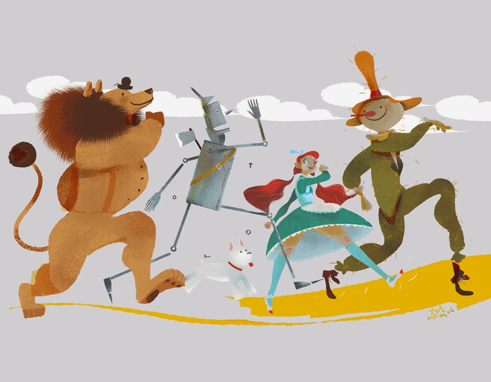
And this piece of joy by Chiachi Wang (Popnbox):
 
 
Occasionally I do find an original take on the subject such as this gorgeous piece by Júlia Sardà (below) but they are few and far between.
.
 
Therefore, the obvious thing seemed to be to go back to the source material and see how L Frank Baum described the characters. Maybe that would offer me some flexibility.
 
There is no description given of Dorothy whatsoever other than she is 'a little girl' and 'a well-grown child for her age' around the same height as a Munchkin. She does, however, get dressed before setting off down the yellow brick road: 'It was gingham, with checks of white and blue; and although the blue was somewhat faded with many washings,it was still a pretty frock. The girl washed herself carefully, dressed herself in the clean gingham, and tied her pink sunbonnet on her head.' So, to be totally faithful to the book, a blue gingham frock and pink sun bonnet would be needed, plus a basket of bread that she takes with her, covered by a white cloth. Her shoes, which she recovers from the dead witch, are silver and not ruby. Toto, incidentally, is described as 'a little black dog, with long silky hair and small black eyes that twinkled merrily on either side of his funny, wee nose.' I decided to make my Dorothy quite young to get away from the Judy Garland 'I'm clearly in my 20s but dressed as a schoolgirl' image. My 10 year old granddaughter Leah became the model.
 
I had a very clear idea in my head for the Scarecrow. When I was growing up in Cornwall, farmers and allotment owners would often use pumpkins - sometimes fresh, sometimes leftover from Halloween - as the heads for scarecrows. However, in the books, the Scarecrow is described thus: 'Its head was a small sack stuffed with straw, with eyes,nose, and mouth painted on it to represent a face. An old, pointed blue hat, that had belonged to some Munchkin, was perched on his head,and the rest of the figure was a blue suit of clothes, worn and faded,which had also been stuffed with straw.' That effectively scuppered my plans ... unless I swapped him out for another Oz character called Jack Pumpkinhead who first appears in The Marvelous Land of Oz. I knew he'd be a more striking looking character than a chap with a sack for a head. It then occurred to me that my painting didn't have to be set within the confines of the first Oz book. There are 14 canonical books in the series written by Baum himself (and a handful of plays and short stories) plus a further 50+ books by other authors. It seems quite possible, therefore, that Dorothy and Toto could have walked along the Yellow Brick Road at some point with the Tin Woodman, Jack Pumpkinhead and the Cowardly Lion. Plus, of course, I could now change the characters' clothes if I wanted. Suddenly, I could exercise a lot more creative licence.
 
And, yes, the inane look on Jack's face probably does owe something to Groot in Guardians of the Galaxy as it was a film I watched during the sketching stages. That said, I tried it out on a real pumpkin first!
 
 
The Tin Woodman was nicely short on description: 'One of the big trees had been partly chopped through, and standing beside it, with an uplifted axe in his hands, was a man made entirely of tin. His head and arms and legs were jointed upon his body, but he stood perfectly motionless, as if he could not stir at all.'  So my Tin Woodman went through a number of development stages before I arrived at a shape I liked (and which pleasingly echoed the body shape of Tik-Tok, a character from the Oz book Ozma of Oz and the feature film Return to Oz.)
 
 
I didn't bother to sketch the lion as I thought, 'Ah, it's just a lion - I'll wing it on the day'. In retrospect it was a very stupid decision as you'll see.
 
Anyhow, here's the final composition sketch and the underpainting. I chose a 20" by 16" by 3/4" double-primed canvas and used a watered down burnt umber paint.


Now came the fun part, slapping on the paint. First stage, as always, is .... get rid of the white. For this painting I used a combination of Daler Rowney System 3 acrylics and Liquitex Professional heavy body acrylics. 


I've always been a bit ropey on perspective so I spent an indecent amount of time mucking about with the 'bricks' which, to be honest, are probably better referred to as 'yellow slabs'.

 
It was around this time that I made several important decisions: (1) to include some nasty anthropomorphic trees as they were some of my favourite characters in the 1939 film, (2) to give the Tin Woodman a coal scuttle for a helmet as everyone does the funnel, and (3) to sort the lion out as he looked more like a bear with a mane.
 
 
It was then that I realised my mistake in not sketching lions beforehand; I had no idea how to draw one. Very quickly things went from bad to worse. No wonder the poor sod looks so worried. He went from this (above) to this (below) ...
 
 
And then, finally, (after some much needed research and sketching of lions) to this:
 
 
By this time I'd done some work on Dorothy, moved one of the Tin Woodman's legs to give him a jerkier gait, turned his axe around and given him a good patina of rust, and added in some more trees. You may recognise the tree face on the left. It's an homage to the 1974 sci fi film Zardoz, which references The Wizard of Oz (the clue is in the name). In the film, a huge stone head flies about the place subjugating the population, much like the giant scary head of Oz does in Baum's original tale. It seemed like a fun thing to include - a little visual joke that maybe only a few film nerds would get. Plus, the face is very reminiscent of many pagan 'Green Man' carvings and masks you find around the UK.
 
 
Finally, I repainted Toto (as I'd got his body shape all wrong on the first attempt - I'm as crap at dogs as I am at lions) and finished Dorothy off. And, by that, I mean changed her dress. I'd started off using pink as it seemed suitable for a girl of that age but the colour jarred with the overall composition. I realised that blue would compliment her eyes and the Wedgewood blue of the sky. So I made the dress blue or, rather, the night-dress. The whole Oz saga has a kind of dream-like quality and the film ends with Dorothy waking up so shouldn't she be in a nightie? By coincidence I then discovered that the lady who had bought the painting loves the colour blue. So all was well.
 
Here's the finished painting.
 
 
I hope you like it.
 
Note: All artwork copyright (c) 2015 Stevyn Colgan and the respective artists named above.


Monday, 21 October 2013

Boys in Blue - Step by Step

Another painting in my Cliché Britain series. This one was a little different. The four previous painting - Meat and Two Veg, Vicars and Tarts, Fisherman's Friends and Teacher's Pet - were all completed in full colour on 50.5 x 40.5cm (20" by 16") box canvases:

 
However, while painting Teacher's Pet, I found myself wondering if I could do a painting that is monochromatic. The obvious thing to do was something in sepia or shades of grey but no subject (or attendant cliché) jumped out at me. But then the phrase Boys in Blue occurred to me and the painting virtually jumped fully formed into my head. Plus, I had a couple of sketches left over from when I did the prize painting for Constable Colgan's Connectoscope:


So, here's the sketch and first blocking in. I decided to use a smaller 30 x 40cm canvas and to mask off an outer frame (with masking tape - what else?) so that the finished portrait would look something like an old-fashioned photo:


My first idea was to make the helmet comically small, such as those you buy from joke shops. But, as the painting progressed, it became obvious that a full sized helmet would work better and the painting would fit better into the series. So I resized it and began to build up the depth of colour and shading.


I took some liberties with the word 'blue' by adding a touch of quinacridone magenta (which has some blue in it) to the background. It's such a beautiful colour and it helped lift the figure off the canvas. I took off the masking tape at this point and painted in some eyes, buttons and collar numbers.


The final job was to tidy up generally, sort out the asymmetric sideburns, and shrink the helmet badge which, I realised, was way too big. For accuracy there should also be a chin strap ... I'm not sure what to do about that. Sigh. I'll probably just leave it. Any road up - here's the finished painting:


And, yes, I know it bloody looks like me again. Apparently. I must address this with the next painting.

Wednesday, 25 September 2013

Teacher's Pet - Step by Step

Here's how I did the latest painting in my punning British stereotypes series. Having completed Vicar and Tart, Meat and Two Veg and Fisherman's Friends, I needed a new subject. So I asked the great and the good of Twitter and they came through, as always, with some excellent suggestions. The one that immediately suggested a fun painting to me was Teacher's Pet and I'd soon worked up a couple of rough sketches.


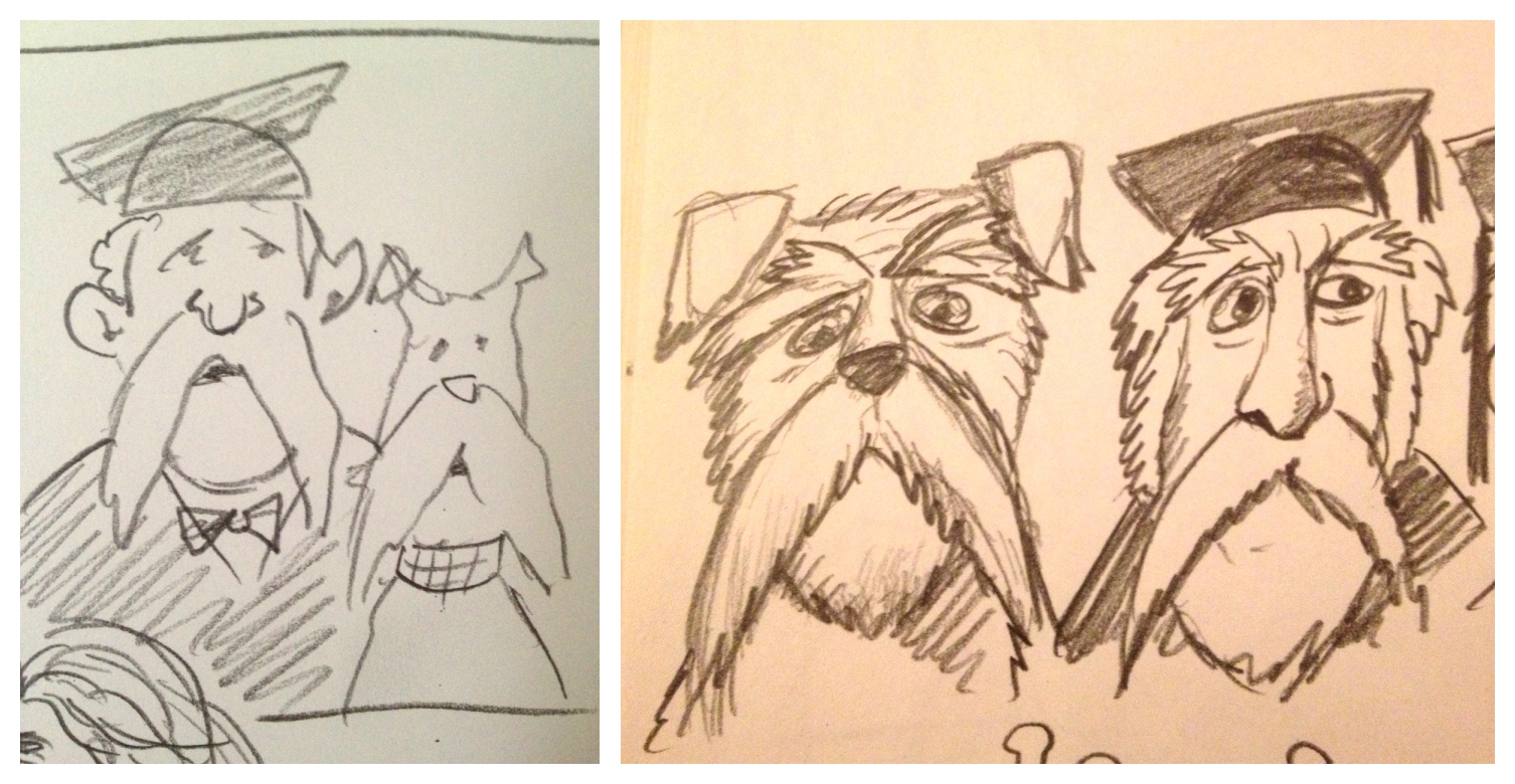
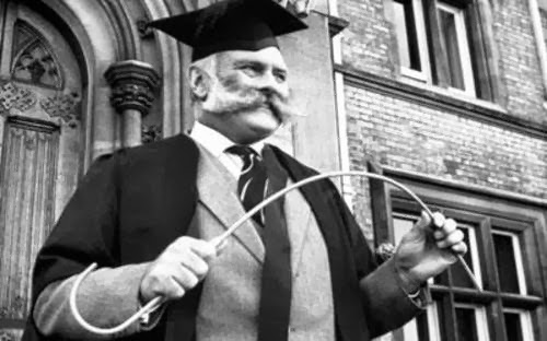
What appealed to me was the idea of making the teacher and the dog look like each other. So I did some picture researching and found the perfect dog - the wire haired fox terrier. It looks almost human. Perfect. It was also, coincidentally, the day of my photographer brother Si Colgan's graduation from Falmouth University, having won himself a place on their prestigious BA course in photography (it's considered to be the best in the UK). His gown and those of his tutors were useful reference too. Other inspiration came from childhood memories of old Will Hay films, of Jimmy Edwards in Whacko! (he grew that extraordinary moustache to cover scars he got as a pilot in WW2 you know), and the teacher from The Beano's 'Bash Street Kids'. And, of course, the acid caricatures of the late, great Ronald Searle:


So, having got a basic idea of what I wanted to do, I got my standard 16 x 20ins pre-stretched, pre-primed canvas and pencilled in my teacher and dog. Then I did the underpainting to get an idea of direction of light etc.


From the start I was quite pleased with this one. All I'd need to do was make sure that the characters stayed looking like each other. By the end of Day 1 (and about an hour of painting), I'd 'got rid of the white' - i.e. had most of the large areas blocked out - and had marked in pen where some details would go.


Curiously, when I came to do some work on the painting on Day 2 I almost wished I'd left it purely in sepia tones. I rather liked it. Maybe I'll do a painting in monochrome next? Anyway, on with Day 2 and I added some background and blocked in the main figures. I then started work on the teacher's face; I was quite pleased with the hangdog look I started to get. It reminded me of the late, great Clement Freud MP, co-star - along with Henry the Bloodhound - of those old 'Minced Morsels' TV adverts from the 60s and 70s. That said, my teacher looked a little too angry. I'd need to fix that.


He was also a little lopsided and the nose needed some work too. So, a good Day 2 and I was able to work much later than usual due to a new daylight bulb I've installed in my office/studio. It's a real boon. End of play, it looked like this:


Day 3 began with work on the two main characters. I spent quite a long time trying to get them to have similar expressions - which did mean painting out the teacher's eyebrows and starting over. Much more Clement Freudian. Next, I tried using masking tape to create pinstripes on his waistcoat but it looked all wrong; the lines were just too straight and too thick.


After a bit of faffing about, I decided to lose the waistcoat altogether and put him in a white shirt and tie - the tie would have my old school (Helston School) colours of blue with gold stripes. I figured it might be nice if the dog's collar mirrored this. So, here's the painting at the end of Day 3:


Day 4 began with some tidying up of the dog's moustache and then the teacher's shirt and tie. I then tidied up his gown. But the whole composition still seemed ... unbalanced. There was just too much 'open space' on the bottom right of the painting. So, taking one of those mad, brave steps I so often do, I decided to add a hand and a cane. A rubbish hand. Look how bad it is. LOOK! Sigh.


Yup, I had to do a bit of work on that hand to get it right. I'm rubbish at figure drawing. But, I think my efforts were rewarded because, at the end of Day 4 (and another three hours of painting time), I reckon I was close to calling the picture complete. It certainly looked like a better painting.

Day 5 involved painting in the tie and dog collar, adding a few shadows and liver spots and some detail on the cane. The expanse of white shirt was an issue so I gave him a pale lilac which also helped accentuate the white of his beard. It helped bring the painting together tonally and voila! Teacher's Pet was complete!


So, what have I learned while doing this painting? Well, the background was something new for me. I knew that too much would distract from the foreground figures so I kept it very loose and indistinct. I also learned that white acrylic paint comes in two forms - one for mixing and one for coverage. The mixing form (which I'd bought by accident) is used to lighten other colours but is rubbish for opaque coverage. You need Titanium White for that. I also painted a dog, which was a fun and something new. All I'd ever done before was cartoon dogs.

On the whole, quite pleased :)

Next painting: A Nice Pair of Jugs!